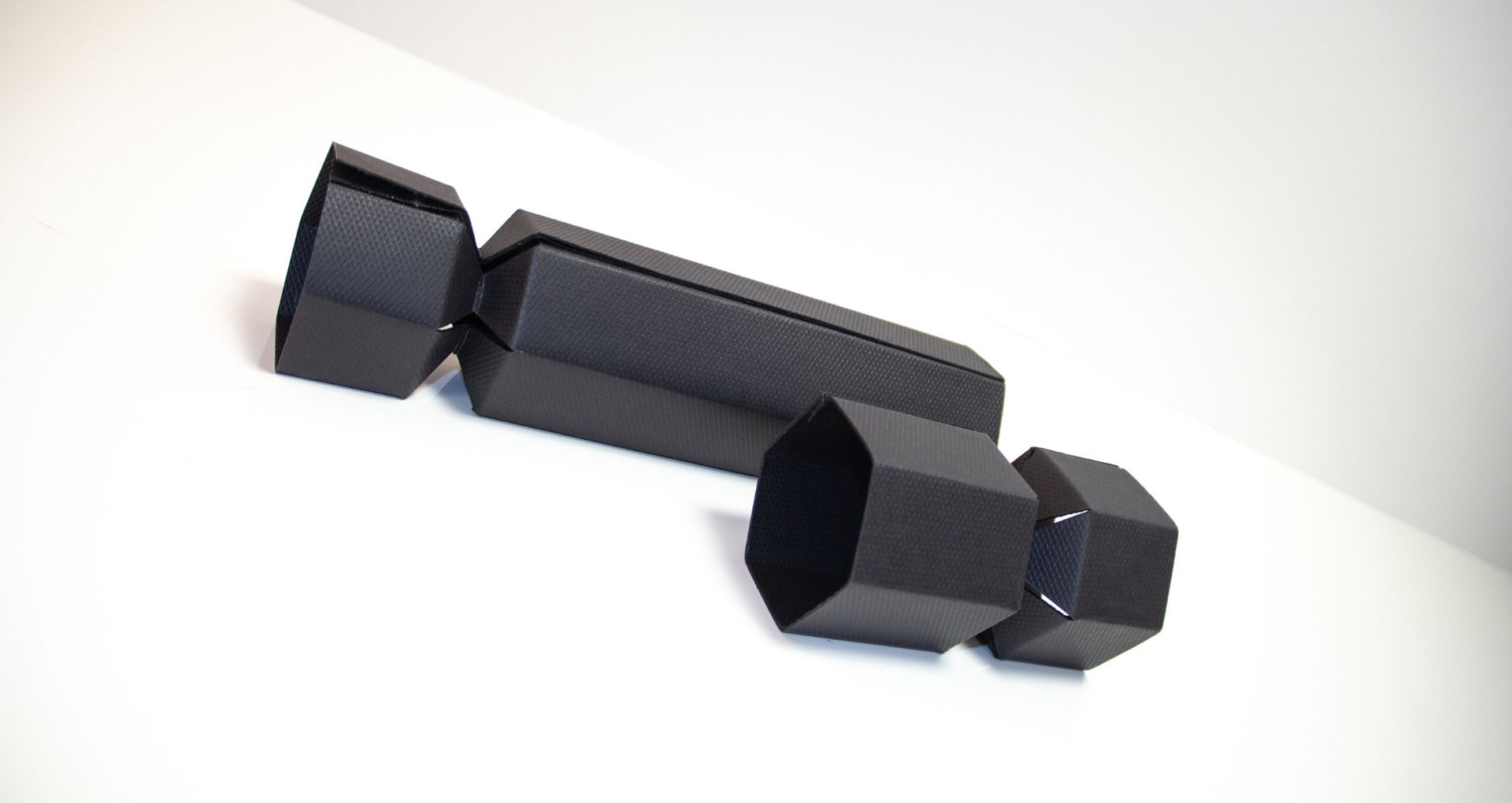
There have been thousands of instances where packaging designs have made us look twice, but only a few of them have the wow factor that judging panels are looking for. With the rapid change in the industry led by technological developments and ever-changing consumer behaviour, it is more difficult than ever to stand out. Brand packaging award winners have truly taken the industry to the next level and these are only some of the most breathtaking examples to date.
Adidas Ultra Boost X
Popular sports brands like Nike and Adidas are famous for paying special attention to both their products and their packaging. The design brief for this box was to create something unique to show off the most important product launch for Adidas in 2018 - a new pair of sneakers specially designed to fit the anatomy of the female foot. The designers were inspired by the name of the product and decided to turn that into something literal - the box the shoes come in.
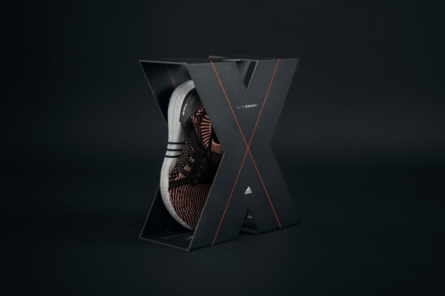
The final product is impressive because it breaks the mould of the traditional shoebox. It’s custom-made, memorable and puts emphasis on the shoes themselves. It clearly differentiates the product from other models in the same collection and reveals its USP - is designed specifically with women in mind. The simple and minimalist design lets the shoes hold all of the attention whilst still being aesthetically pleasing and practical.
The product can be easily removed from the pack without damaging either and the box can be unfolded to reveal more information about the product printed on the inside. Plus, it can be put back together by clipping the magnetic ends together and can also be carried by the handle. An intelligent design that won the first place for Games and Sports at the Dieline Awards 2019.
Steens Honey Hive
How do you uplift the packaging of a commodity item so it catches the eyes of high-end shoppers? You let yourself become inspired by mother nature. An old trick that works every time.
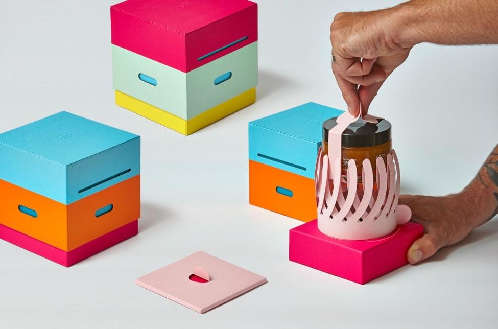
The packaging for this luxe manuka honey might not scream inspired by nature at first glance, however, with a closer look, the genius design intentions become apparent. The use of a vibrant and varied colour pallet was inspired by the fact that honey bees are attracted to flowers due to their colours. The box is meant to imitate painted beehives similar to the ones found around the New Zealand countryside. Its geometrical design definitely stands out on the shelf among the usual honey jars and grabs the customers’ attention.
And because great design means that the brand experience doesn’t end in the shop, the box continues to delight when it’s opened at home. Upon lifting the top of the “hive” (as a real beekeeper would do) you discover the jar embraced by a paper manuka flower. By twisting the bottom of the pack, the petals unfold and reveal the precious product. A truly outstanding unboxing experience, so it’s no surprise that it won three gold awards at the Dieline Awards 2019.
Cook & Nelson's Hamper boxes
Hamper boxes are a staple present option for all kinds of occasions, but little has changed in their presentation over the years. Enter the Cook & Nelson hampers - a reinvention of the traditional wicker baskets.
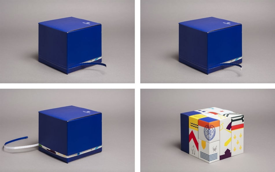
The hamper design is as exclusive and full of personality as its contents - artisan food products from around the world. Each item is individually packed in a box that alludes to its country of provenance. Stylized patterns and national symbols such as Roman coins and sheep adorn the small boxes and hint to the product inside. Bold colours on a white background also make the packs look modern and elegant.
The custom design of the product boxes doesn’t stop at the aesthetics. The shape and size have been customised to make them fit perfectly in a larger box, just like an advent calendar. Unique pull tabs have been used to make them easy to open and keep the products secure at the same time. From cellophane and wood shavings to a blue cube, that’s a transformation worthy of the first place at the Dieline Awards 2019.
Zero Box
Let’s redirect our attention to a design which focuses on sustainability. The Zero Box developed by the Chinese company Voion Printing Group is a solution to the enormous number of boxes that get shipped around the world and can’t be recycled because they are secured with plastic tape. The possibility of saving over 5 billion cardboard boxes every year landed this break-through box design an award at the iF Design Awards 2019.
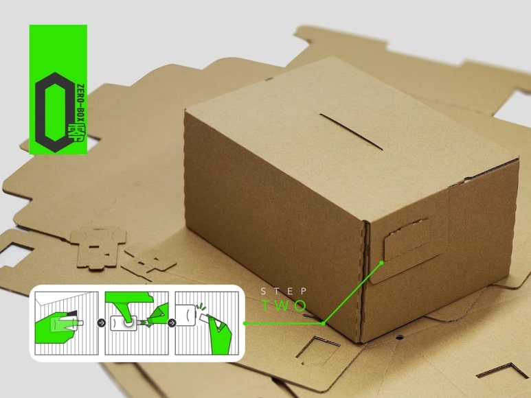
The box is not only sustainable but also functional with a patented system of locking securely and protecting the goods inside. Once you’ve received your delivery, you can re-use it or recycle it. A much-needed initiative that could be implemented at scale in the future.
XBox Adaptive Controller box
This great example of inclusive packaging design won a diamond award at the Pentawards 2019. The packaging and the shipping box, just like the controller itself, are specifically designed for gamers with limited mobility.
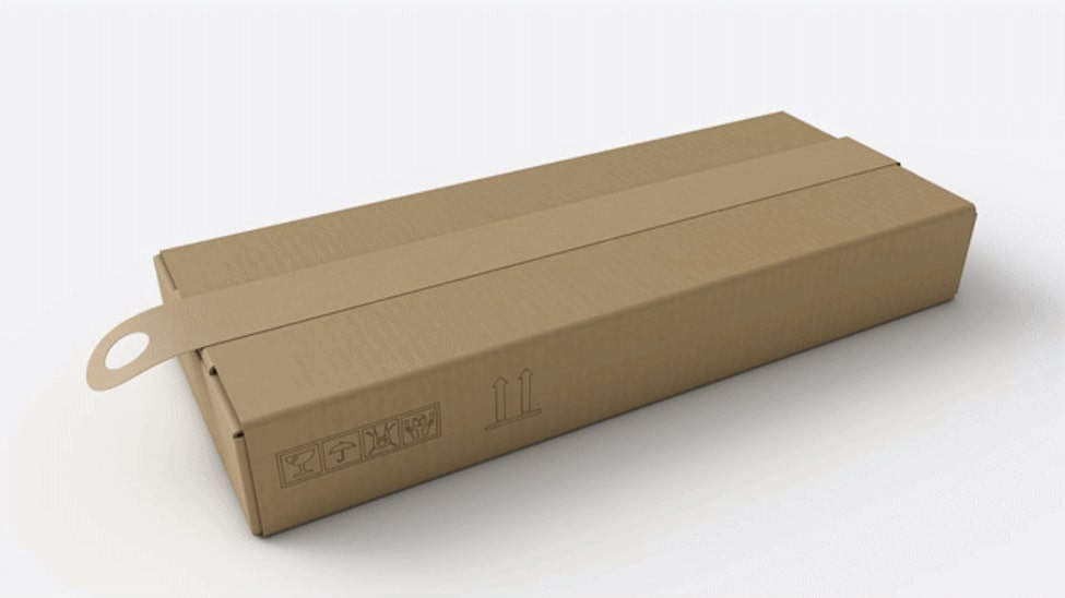
The shape of the box is rectangular and not much bigger than the controller, which makes it easy to handle. The design agency replaced twist ties and zip-cords with loops and hinges so that the user only needs one hand for unpacking. Instead of tape, a cardboard loop is used to seal the box and when pulled and removed, the box pops open.
No plastic or bubble wrap has been used, which means less hassle for the gamer. A second and a third loop allows you to open the hinged top and pull the controller out. Every step of the unpacking journey has been thought through with the end-user in mind. It’s pretty brilliant, but should we really expect any less from tech giant Microsoft?
Omdesign wine bottle packaging
To celebrate its 20th anniversary, Portuguese design company Omdesign developed a limited edition packaging design for a wine bottle that was given as a present to its partners and clients. Inspired by hundreds of years of Portuguese history and traditions, the bottle is inserted into a monkey’s fist knot made out of sisal, which sailors have been using for centuries.
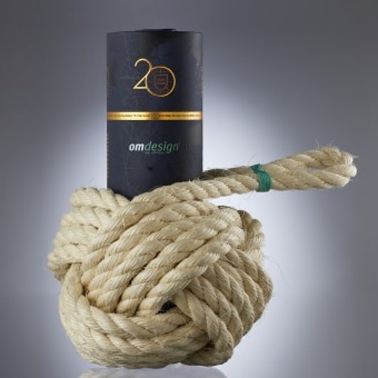
Another throwback to the country’s past is the ancient map printed on this high-quality cardboard tube and the wax seal. Attention to detail doesn’t stop here, as more nautical elements were used such as a sling knot around the neck of the bottle, which is something that sailors used to do to carry wine bottles and dip them in water to keep them cold.
The originality of this design lies in its symbolism and the way all the different design details come together and deliver a uniform look. This adventurous design brought home a silver award at the A’Design Awards in 2019.
These examples demonstrate that the best packaging designs in the world are not only pleasing to the eye but innovative on multiple fronts. Be it sustainability, user-friendliness or the overall brand experience, 21st-century designers are consistently able to think outside of the box and connect brands and consumers in new ways.
