For the most part, a product simply isn't a product without its packaging. In an age where aesthetic and appearance is valued so highly, brands must constantly find new ways to innovate the look and feel of their products in order to stand out from the crowd.
For premium brands that aspire to cater to competitive, high-end markets, the packaging of a product is almost as important as what's inside - at least in a marketing sense.
Packaging is all about building character and creativity into a brand, and in this article, we'll explore some of the finest examples of brands that have done exactly that. Without further ado, here's our list of seven of the most inspiring luxury packaging designs.
1. Clavero Bakery
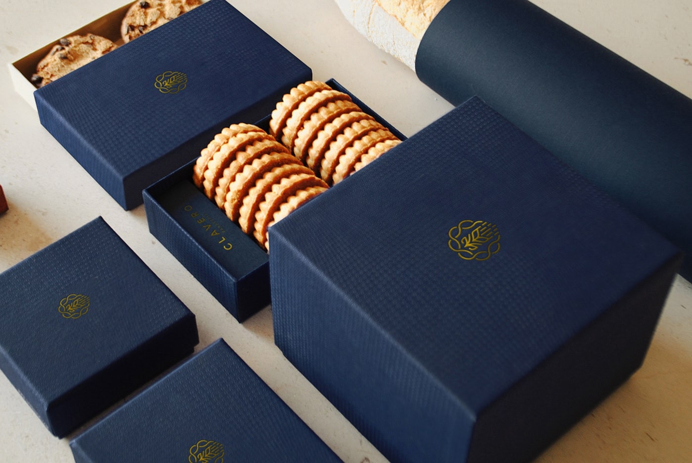
Clavero, an Argentine bakery located in Mexico City, have truly set the bar high with their incredibly neat packaging for their baked-good foods. This simple, minimalistic jewellery-style box design oozes luxury, class and elegance - things you wouldn't typically associate with biscuits and cakes.
As consumers, we naturally associate this sort of packaging with lavish jewellery such as rings or cufflinks, but by creating a similar aesthetic, Clavero are recreating feelings of self-indulgence and luxury.
This is an excellent example of how packaging can be designed to create an entire experience around a brand or product.
2. Beehive Cereal
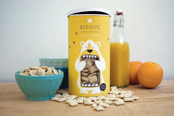
Beehive's unique packaging for their honey squares cereal product clearly goes against the grain of typical cereal packaging. This design incorporates elements of fun, simplicity and practicality all in one small-sized tin.
Instead of the standard box approach, Beehive have opted for a brightly coloured tin with an illustration of a bear (honey's number one fan) on the front. Generally, tins are associated with luxury foods such as biscuits, but Beehave have managed to make it work.
3. Organique Pure
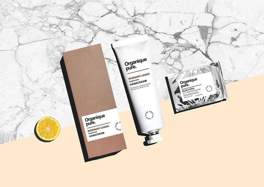
This minimal package design from Organique Pure is a perfect case of 'less is more'.
Organique Pure is a skincare line made from purely natural and organic ingredients - something which is highly valued amongst a large number of consumers today.
In order to appeal to this market, this package uses a blank canvas to emphasise product information, purpose and fragrance type. Less marketing, more product. The use of the cardboard box with the subtle white label is also simple yet distinguished, giving the product a premium feel.
What's more, the cardboard is completely sustainable.
4. Ralph & Ruso
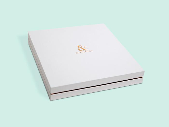
This sumptuous packaging collection perfectly encapsulates everything about Ralph and Russo - luxury, sophistication and style.
The pale grey colour trimmed with delicate rose gold offers an incredibly elegant contrast that instantly catches the eye.
On each box design, the iconic Ralph and Russo logo is perfectly pronounced, raised in gold foil to add that extra element of luxury. To further complement this, each box draw has been given a beautiful dark grey coloured ribbon, giving it a subtle touch of class.
5. Rapha
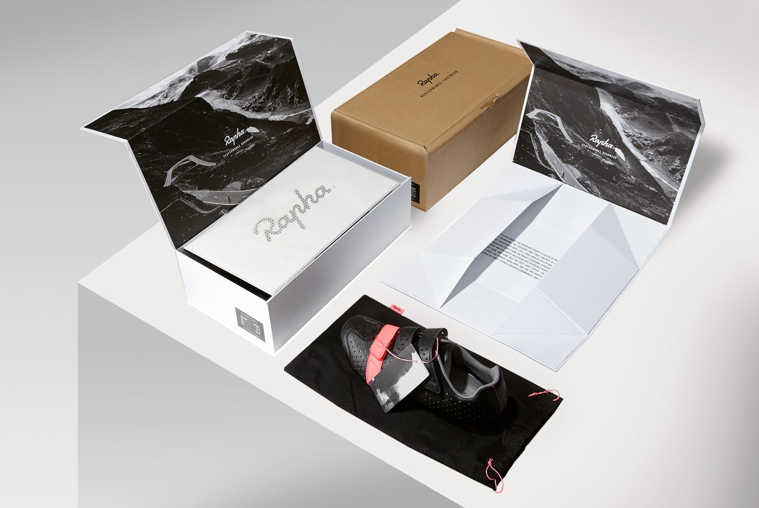
Rapha are renowned for being a high-end sports and lifestyle brand, and this is accurately reflected in this luxury packaging for their new footwear product.
Intelligently designed, the inner box is sleek and stylish. The white canvas provides a captivating contrast with the silver, raised foil Rapha logo. Inside the box itself, you'll notice a dramatic black and white image and crisp white introduction sheet. This really helps to bring the product to life, making the buyer feel instantly connected to the Rapha brand.
A fine example of how small details can make a big impact when it comes to luxury packaging design.
6. Roe & Co
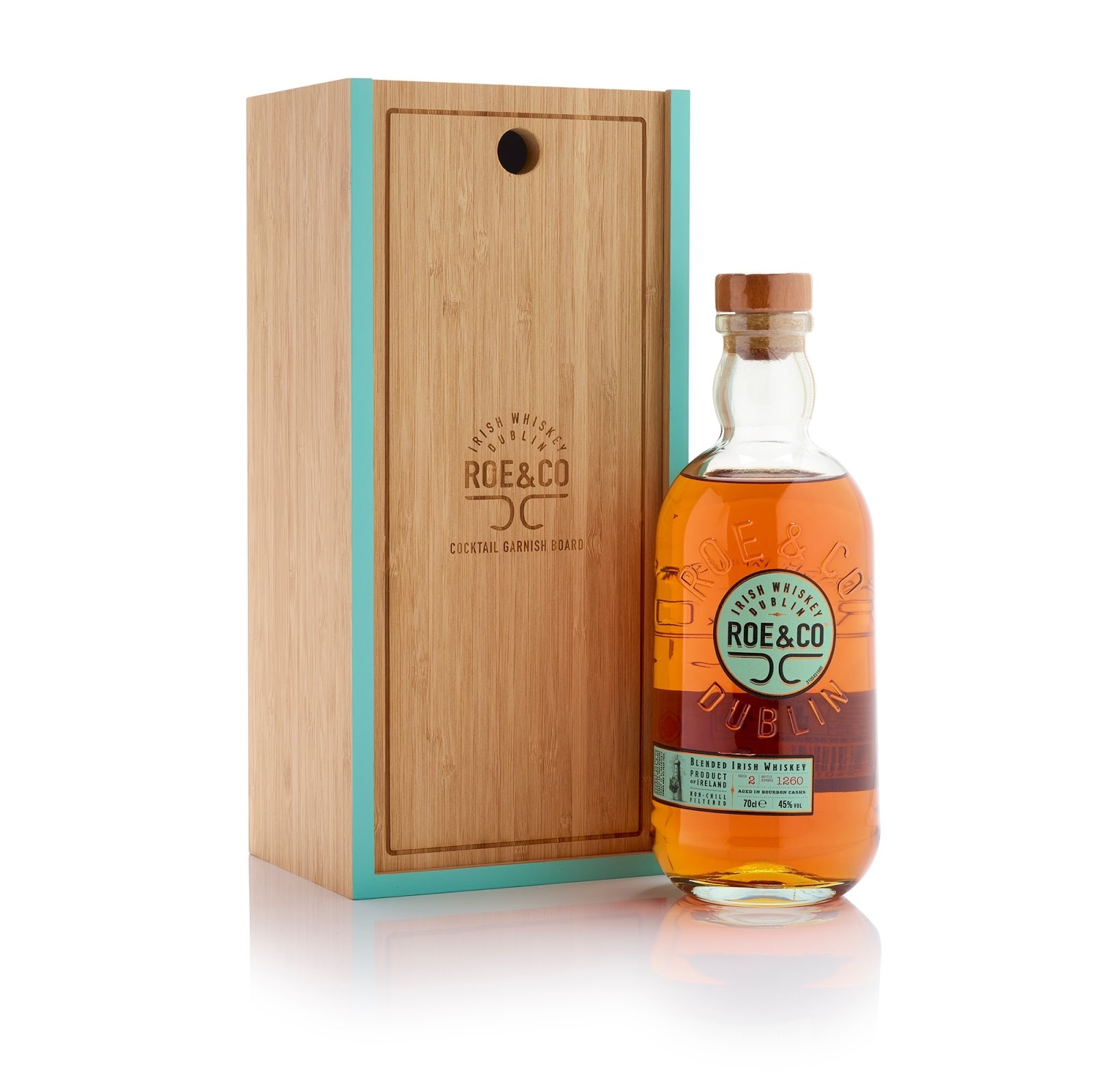
Irish Whiskey brand, Roe & Co, have been very clever with their innovative box design. Created with dual-purpose in mind, the front panel of the box slides out to double up as a cocktail preparation board.
Practical quirks aside, the whiskey bottle is encased in a beautiful hand-crafted bamboo box that exudes rustic charm. The Roe & Coe logo is finely etched into the box which is trimmed with a bright light green border.
Here, both practicality and aesthetics combine to create a truly unique piece of luxury packaging.
7. Rimmel London
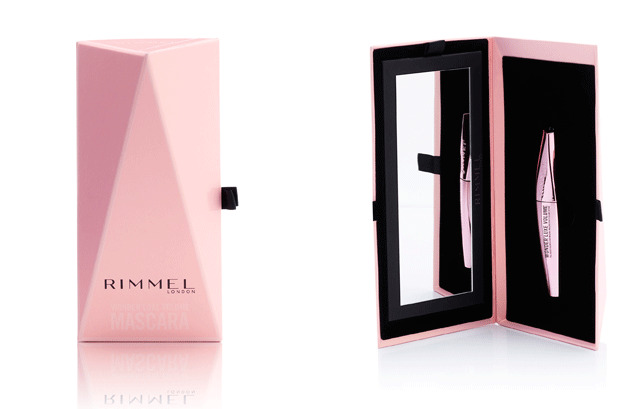
This standout packaging design for Rimmel's Wonder Luxe Volume Mascara is one that really catches the eye. Much like the Rimmel brand, this unique pyramid case is bold, edgy and made to make a statement.
The pink, white and black contrasts give the case a slick, elegant look that you would instantly associate with high-end, premium quality. The subtle black ribbon and delicately embossed Rimmel slogan on the side of the case add further detail to this fine piece of luxury packaging.
Evoking a sense of fun, playfulness and beauty, the Rimmel character clearly shines through in this design.
