

Premium packaging is like meeting somebody for the first time. You get a single chance to make a good impression. Increasingly, the first physical interaction between brand and consumer arrives via packaging.
And with consumers transitioning to online shopping faster than anticipated, driven by lockdown regulations, the importance of brand packaging solutions has soared.
Increasingly, consumers may have never entered the store from which they are ordering products. Premium packaging must encapsulate what physical outlets would otherwise communicate.
Additionally, it must provide memorable and sharable unboxing experiences, and social media provides a vast platform for consumers to share these experiences. For luxury retailers and brands, the opportunity to position consumers as virtual ambassadors is an unmissable marketing opportunity.
The creation of premium, luxury packaging that balances these considerations is something of a fine art. So, we’ve listed our current five favourite examples of retailers that are getting it right.
Selfridges
You will, no doubt, be familiar with the distinctive canary yellow branding synonymous with Selfridges and its brand identity.
For its ecommerce packaging, Selfridges decided to use the strength of this branding as an ace-up-the-sleeve, to maximise the impact of what it calls the ‘yellow moment’ (the moment when the customer first sees the yellow branding).
To achieve this, Selfridges decided on a minimalist, indistinct cardboard-coloured exterior. And, when the consumer lifts the lid, they are greeted with the sunburst of the yellow logo, emblazoned across the entirety of the inner section.
This simple ‘magicians’ trick’ approach provides a luxury packaging solution that playfully beguiles the consumer, deploying a strong brand identity and a unique unboxing experience.
YOOX
We selected YOOX because of its bold move towards achieving complete sustainable packaging and a responsible ethos, exemplified by its courageous ECOBOX design.
Contemporary retail trends lend themselves to a minimal design approach for packaging solutions, allowing YOOX to side-step colour, lettering, and logos.
It is a daring method, but one that completely communicates the intention of this type of premium packaging. The only markings on the box are recycling and sustainability logos.
The consumer, on receiving the box, is conveyed two messages: that the ECOBOX is completely sustainable, and that YOOX is a retailer that takes sustainability seriously.
And they are wise to do so. With younger consumers expectant that brands strive for eco-friendly values, and labels like Burberry vigorously adopting sustainable packaging, the EXOCOBOX has been ahead of trends since it was launched in 2009. The fact that it is still in use, unchanged, over a decade a later, speaks of its success.
Harvey Nichols
As mentioned, the prevailing trend for luxury packing is minimalism. Intricate logos and over-populated designs are becoming rarer, and single colours and fonts are now the status quo.
The principal drawback for brands and retailers is finding a strong identity within those parameters. How do you remain distinct when there is a strong risk of appearing formulaic?
Harvey Nichols found an answer that instinctively sounds counter-intuitive. They embraced a more minimalist packaging design.
All Harvey Nichols packaging is rendered in in the cleanest-of-clean whites. Fonts arrive in either shimmering silver, that can only be fully viewed in the correct light, or mild greys. Boxes are either square or rectangular – and all are absolutely beautiful.
And it works. Whenever we view a swinging, passing white carrier bag, or glimpse a white box underneath a passer-by’s arm we immediately think: ‘Harvey Nichols?’
If Selfridges own the ‘yellow moment,’ Harvey Nichols is taking white packaging entirely for themselves.
MATCHESFASHION
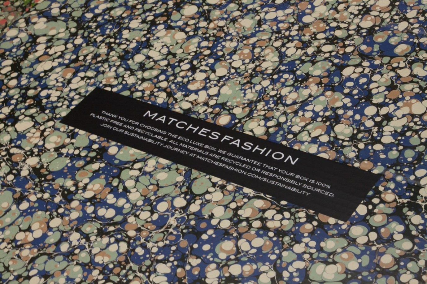
We recently worked with MATCHESFASHION to create a new, sustainable packaging solution that retained their iconic marbling design.
Already a favourite of ours, MATCHESFASHION packaging is central to their branding. Readers who own their app will notice the marble design doubles as the logo.
Where other retailers are moving towards reduced decorative designs, the success of MATCHESFASHION’s boxing is the selection of pattern that has connotations with luxury.
It remains distinct and recognisable. And now, after working with Delta Global, the packaging is entirely recyclable too, thanks to our bespoke technology, the Delta Global Removable Magnet System®.
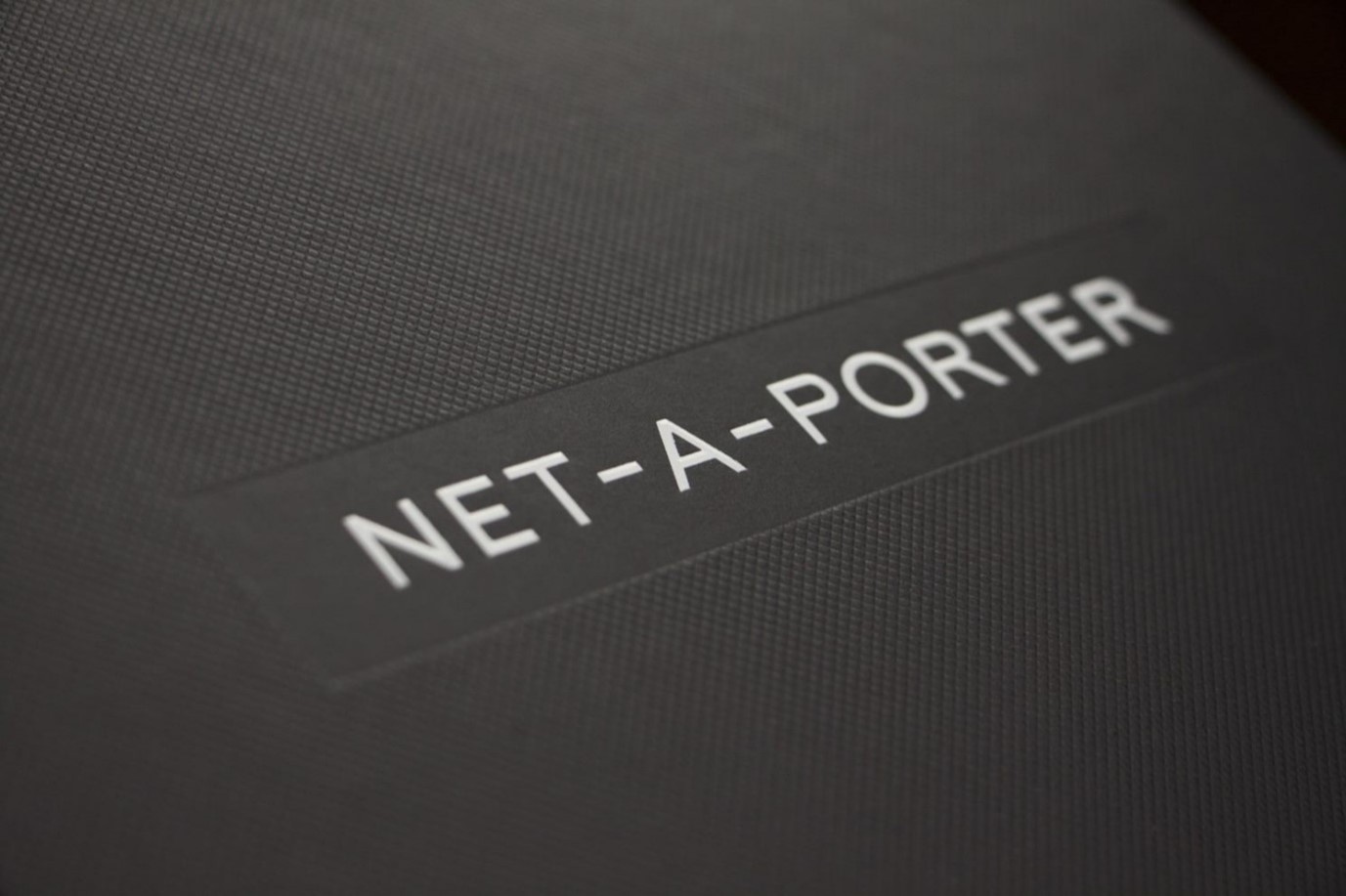
Net-a-Porter
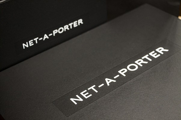
Net-a-Porter is the original innovator in luxury Ecommerce. When it launched 21 years ago, Net-a-Porter immediately grasped the importance of premium packaging as part of the consumer experience
Unlike many of its early competitors, Net-a-Porter did not use its position as an online retailer to short-change the consumer. It provided, through packaging, a retail experience as close as possible to that of physical store shopping.
Net-a-Porter’s black boxes and carrier bags set the standard for the online luxury retailer. Today, with its lavish bows and elegant wrappings, it looks every bit as striking as it did two decades ago.
Get your premium packaging right
For more information on our range of sustainable luxury packaging, contact the Delta Global team today.